TALENOX WEBSITE
Background: Talenox is a cloud-based human resources software platform designed to simplify HR management for SME's. It offers core features such as payroll processing, leave management, and employee profile management.
Role: Brand Consultant | Illustrator | Website Design (Co-designer)
Objective: Give the site a much needed redesign with accompanying branded illustrations. The old colour scheme and illustrations appears dated and old-fashioned. The tagline, "The Friendliest HR Software" is not reflected in the image.
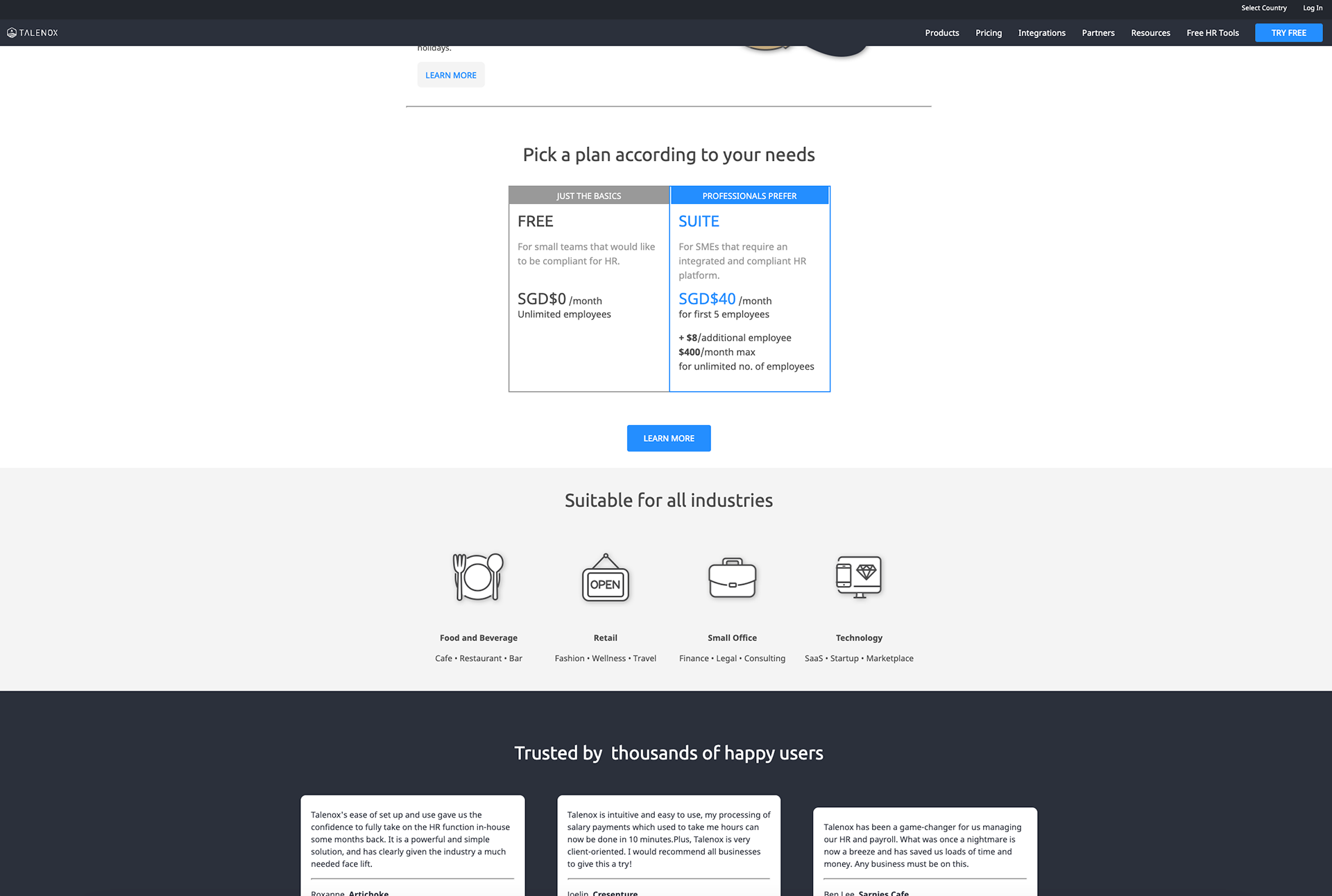
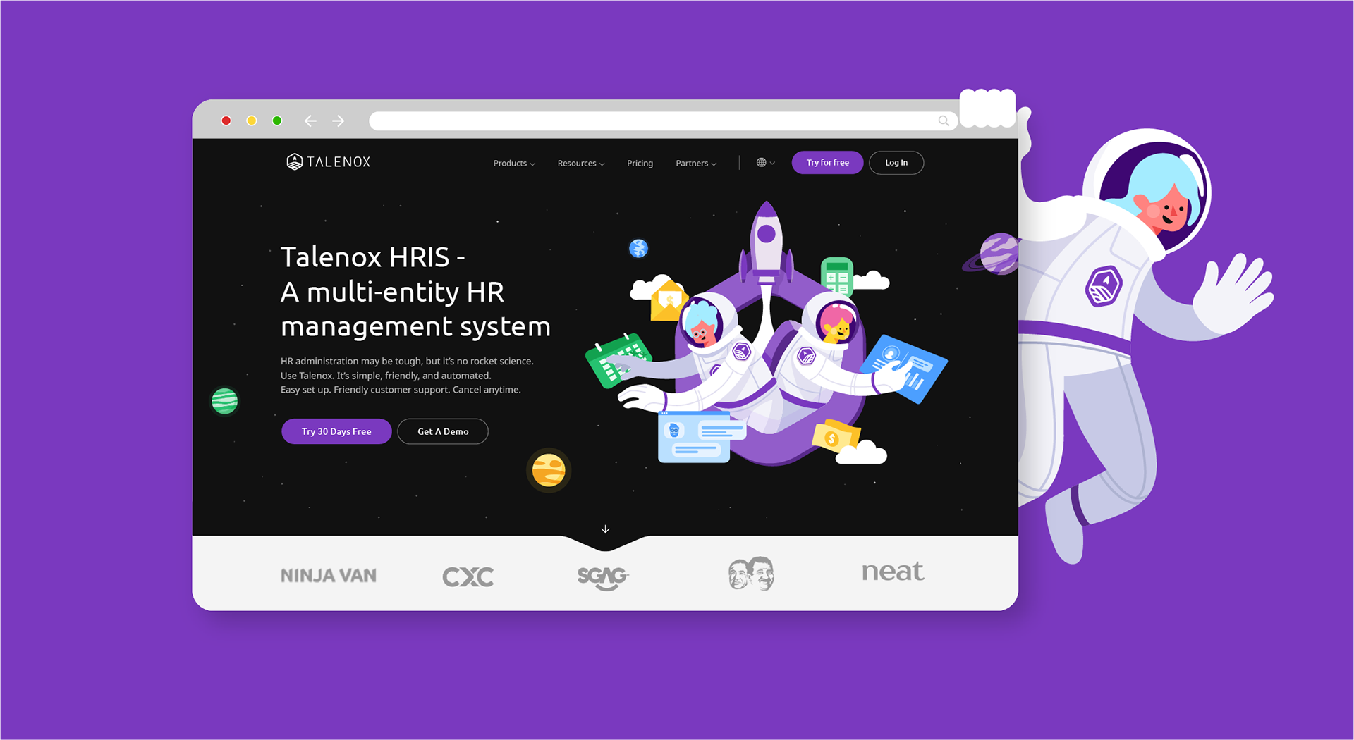
Old Talenox Landpage. Above the fold, Product page, Pricing Table
Brand Audit
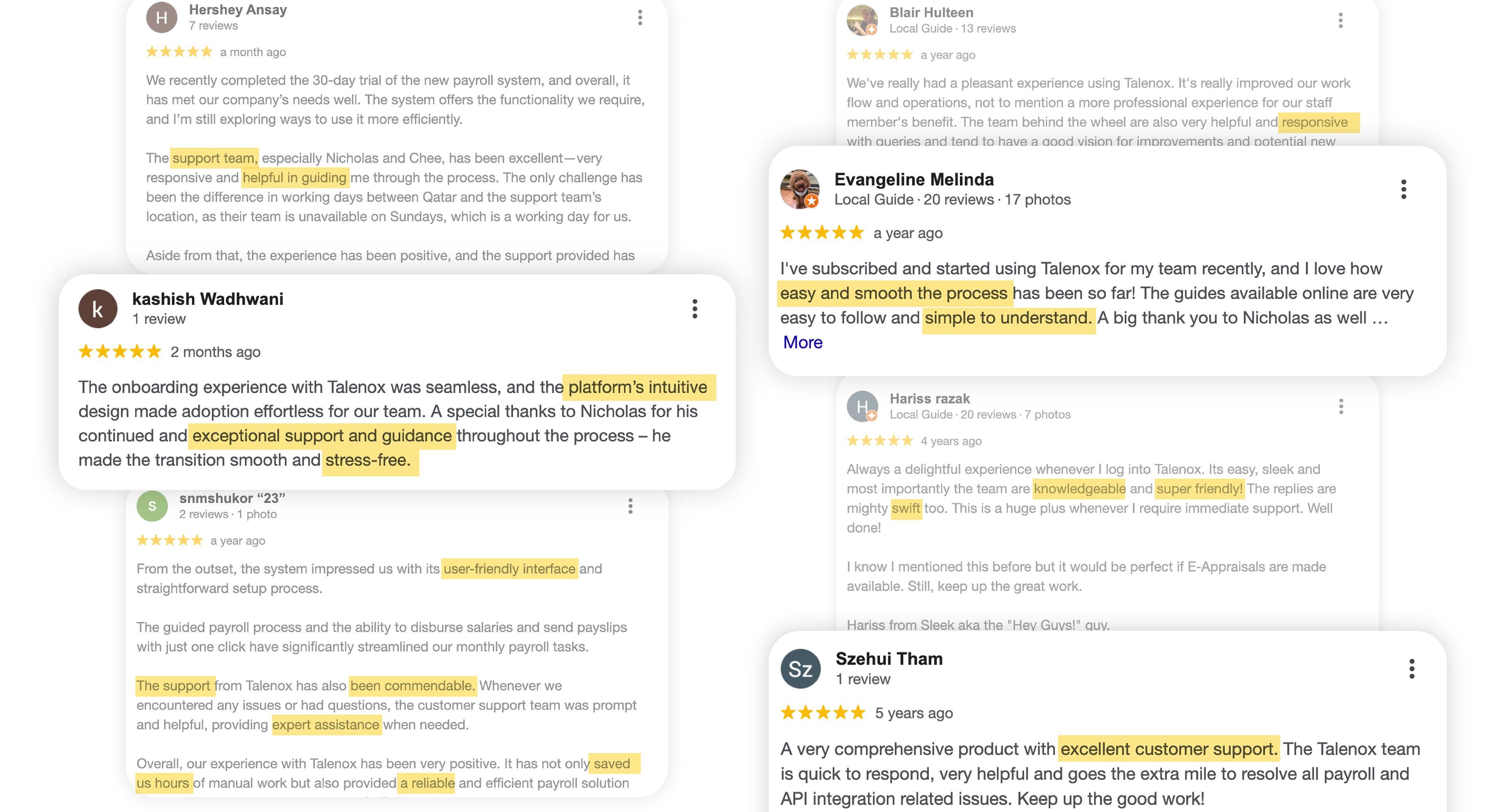
A brand perception survey was conducted with both internal stakeholders and external users to understand how the brand is currently viewed across trust, clarity, and emotional connection. Survey was brief and short with keywords taken from google reviews.
This ensures the rebrand is grounded in opportunity.
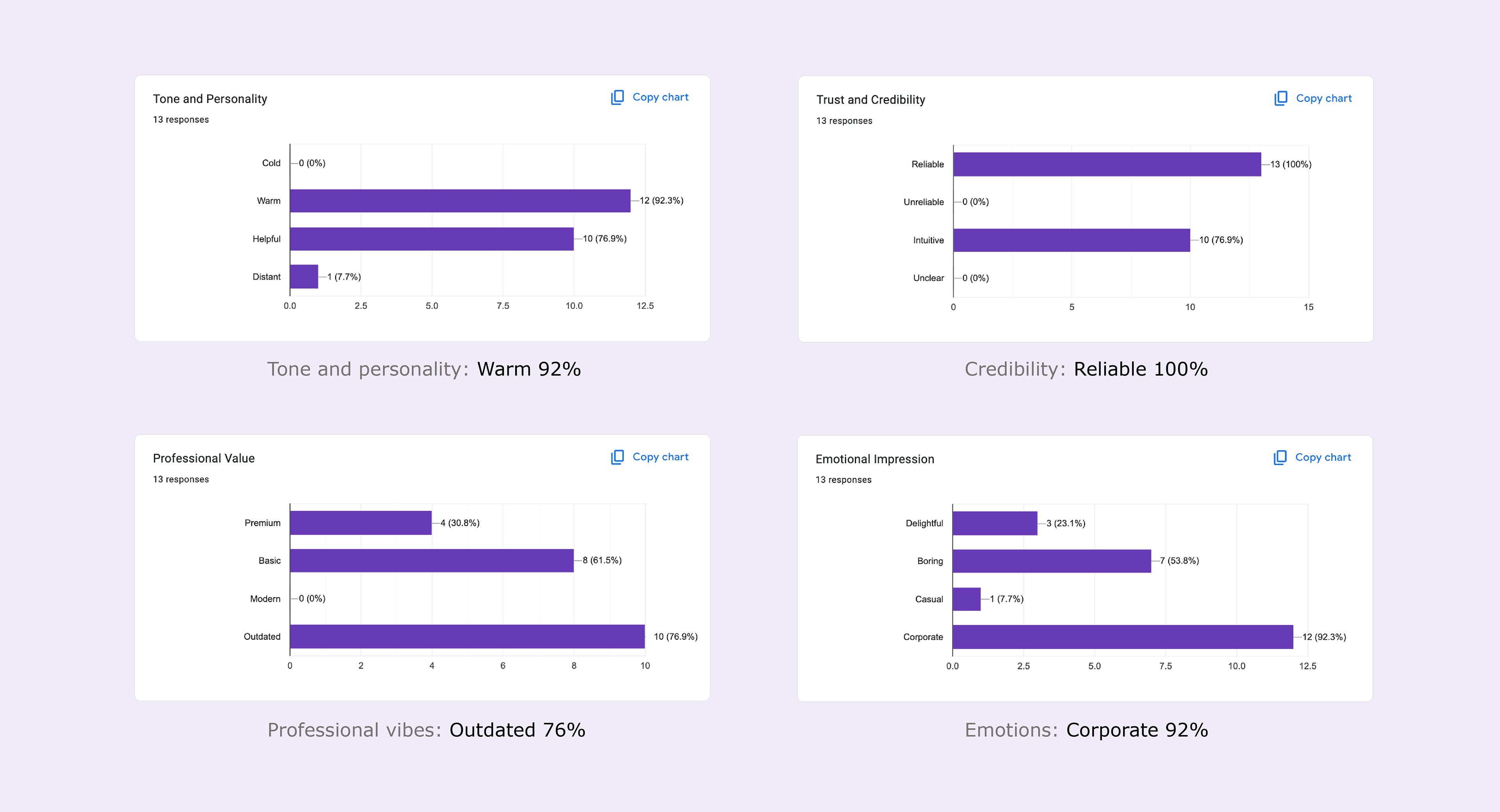
Survey results mainly shows that we are warm and reliable, but looks outdated and corporate
Conclusion:
Our brand is recognised for our outstanding customer success team always friendly, responsive, and going beyond troubleshooting to provide statutory guidance rooted in real expertise. It is in line with the tagline we used, "The Friendliest HR Software".
Our brand is recognised for our outstanding customer success team always friendly, responsive, and going beyond troubleshooting to provide statutory guidance rooted in real expertise. It is in line with the tagline we used, "The Friendliest HR Software".
A competitor landscape audit was created to compare positioning, tone of voice, and visual expression across the category. This helped us identify where we currently blend in versus where we can differentiate.
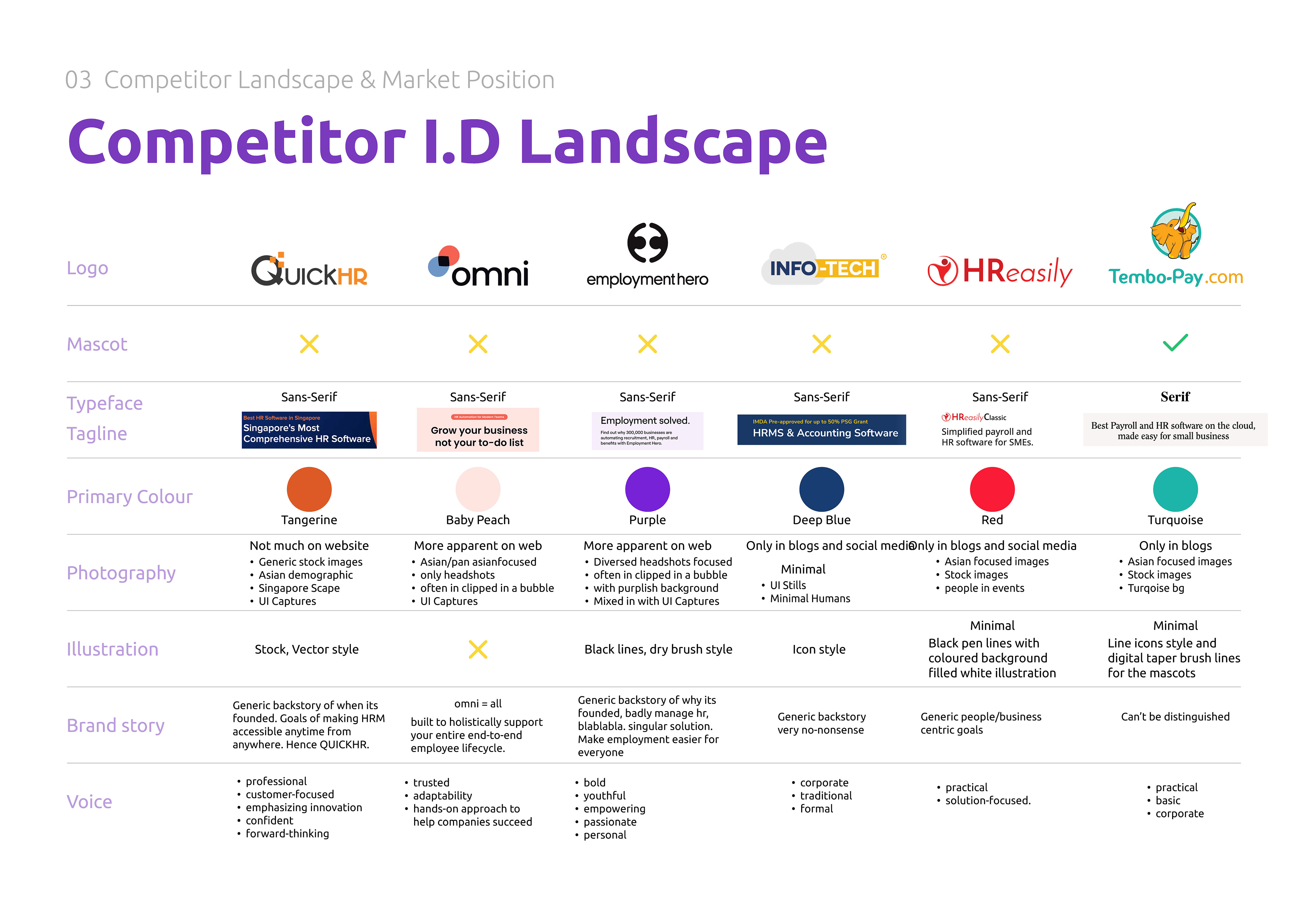
Conclusion: Leaning into illustration and a mascot provides a distinctive and more human visual angle, especially within a landscape where most competitors appear serious and corporate.
The Rebrand
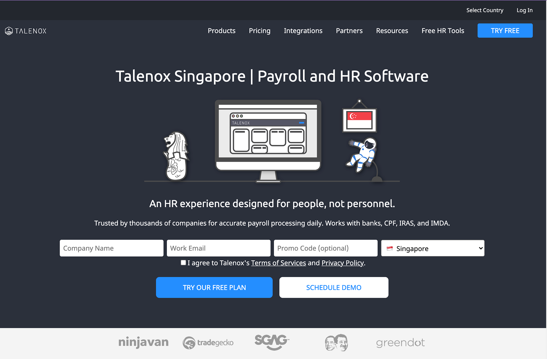
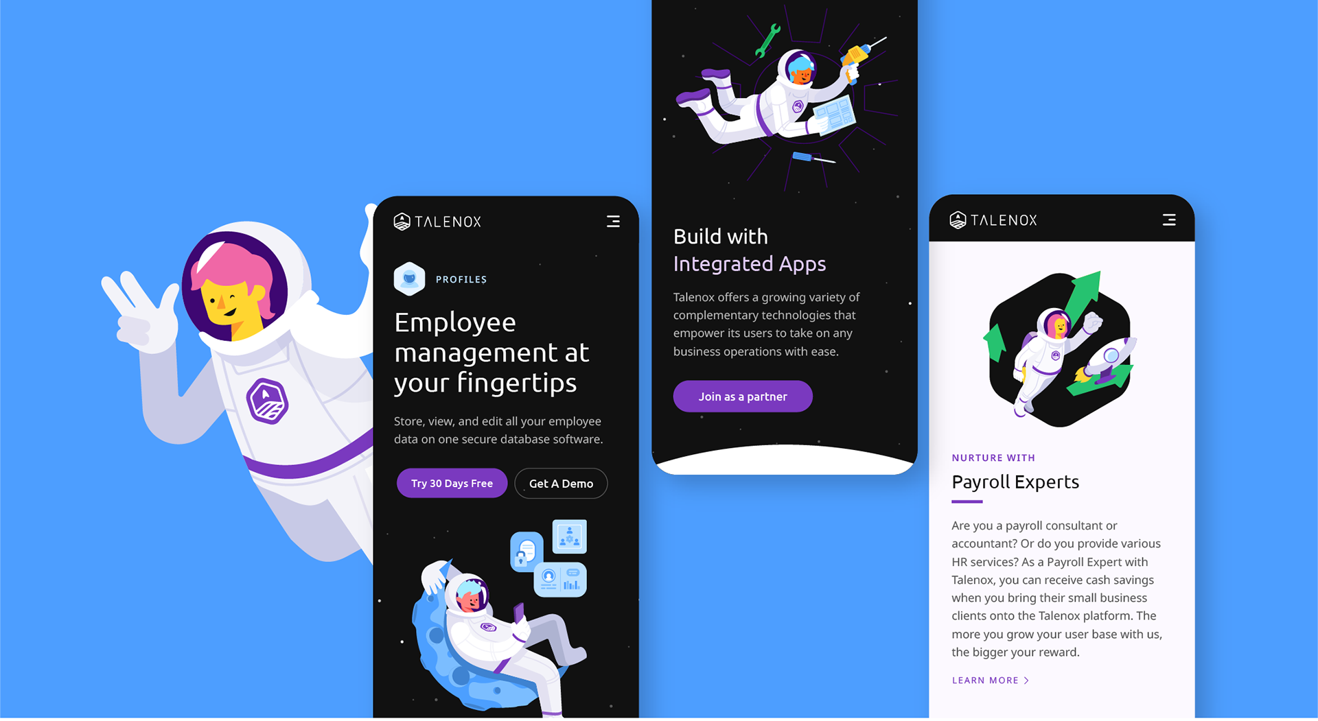
Working with the existing astronaut mascots, I knew I had to bring the engaging and warm nature back into the otherwise “cold and unfeeling” landscape dealing with tech and Human Resource. The brand mascots, now with an added face, gives the friendly aspect to the previous Talenox tagline and also speak to our audiences in positive and inclusive ways.
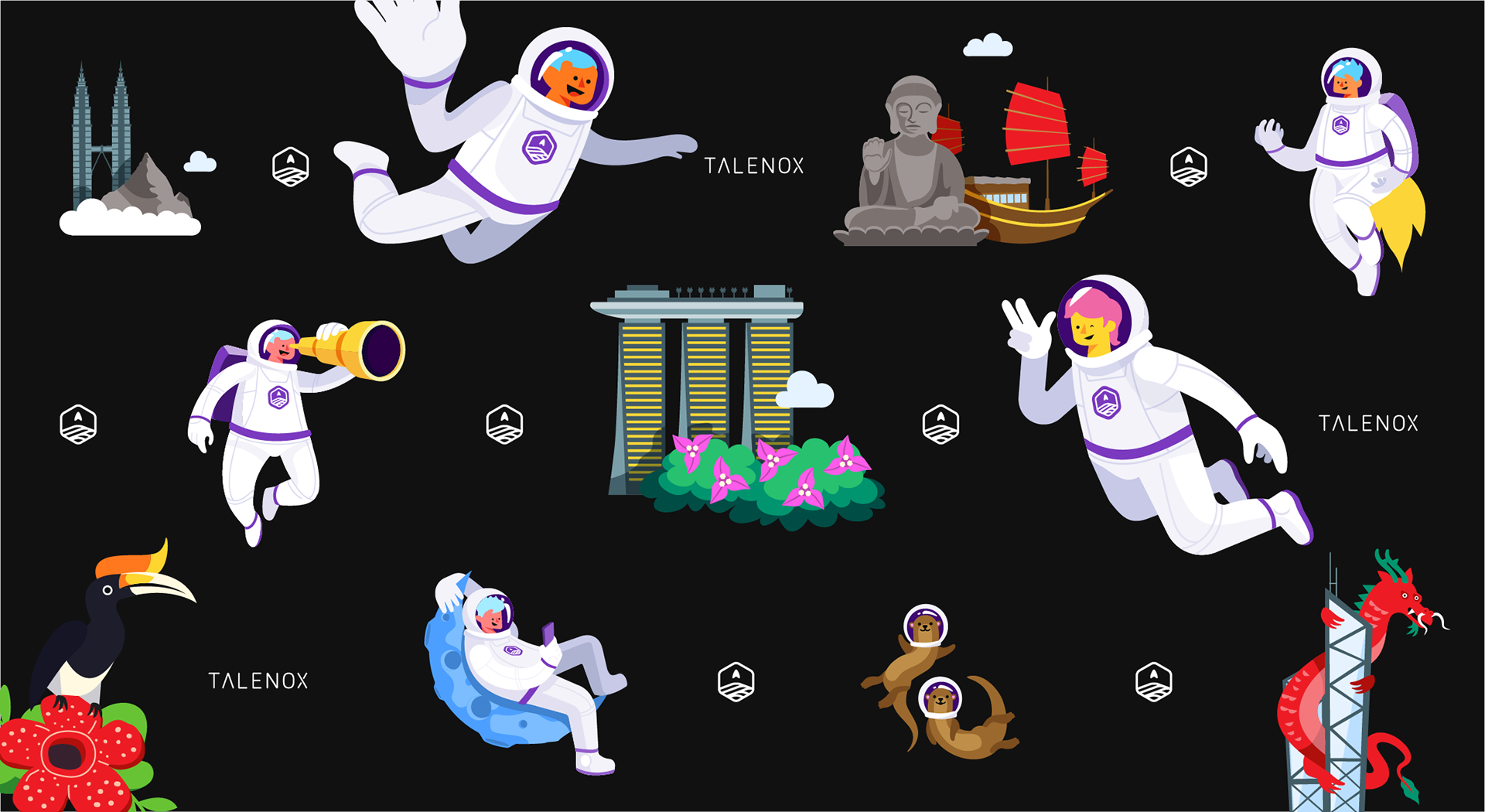
For each country that our system fully supports, we also try to incorporate local elements – such as landmarks and national icons.
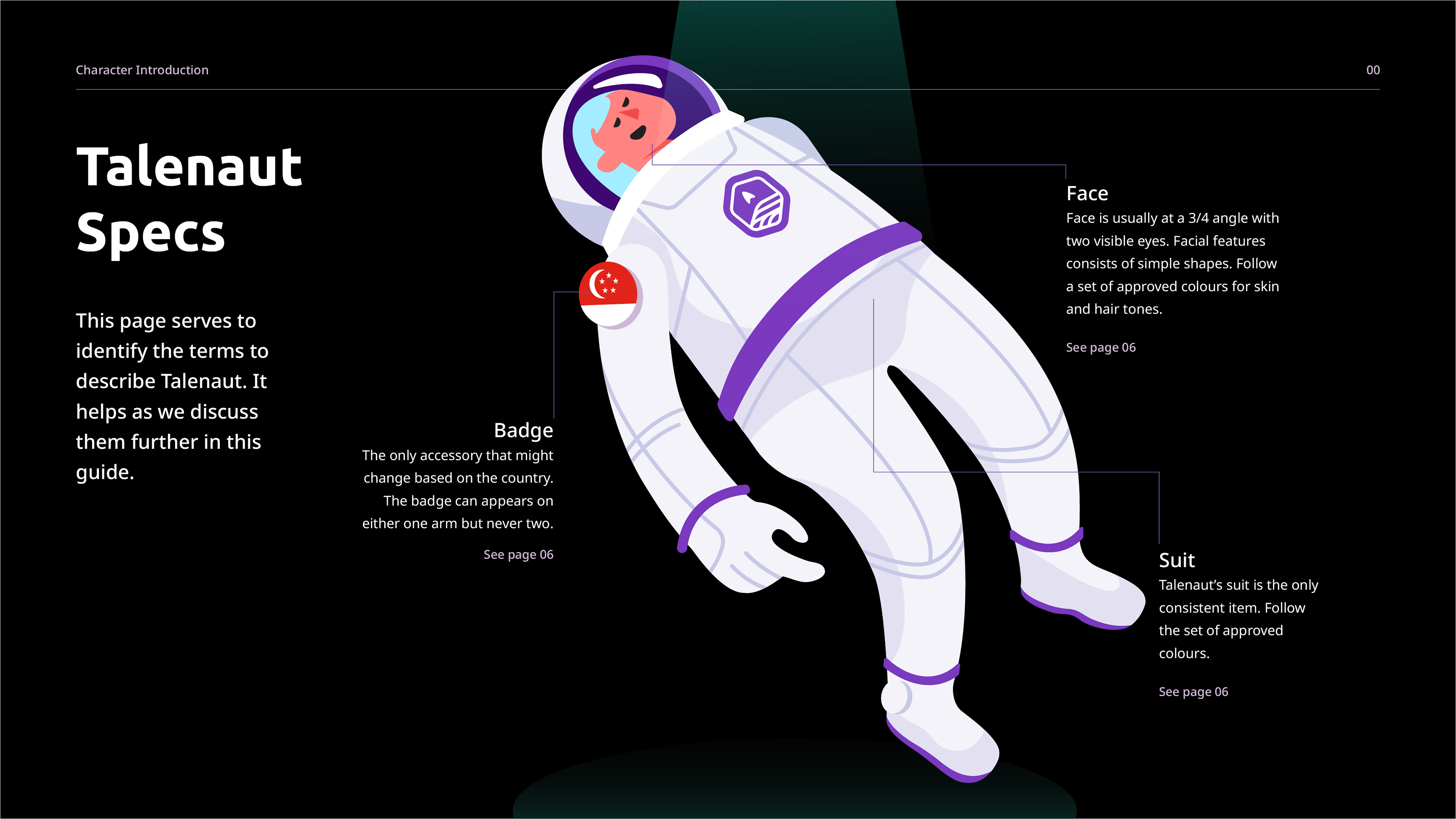
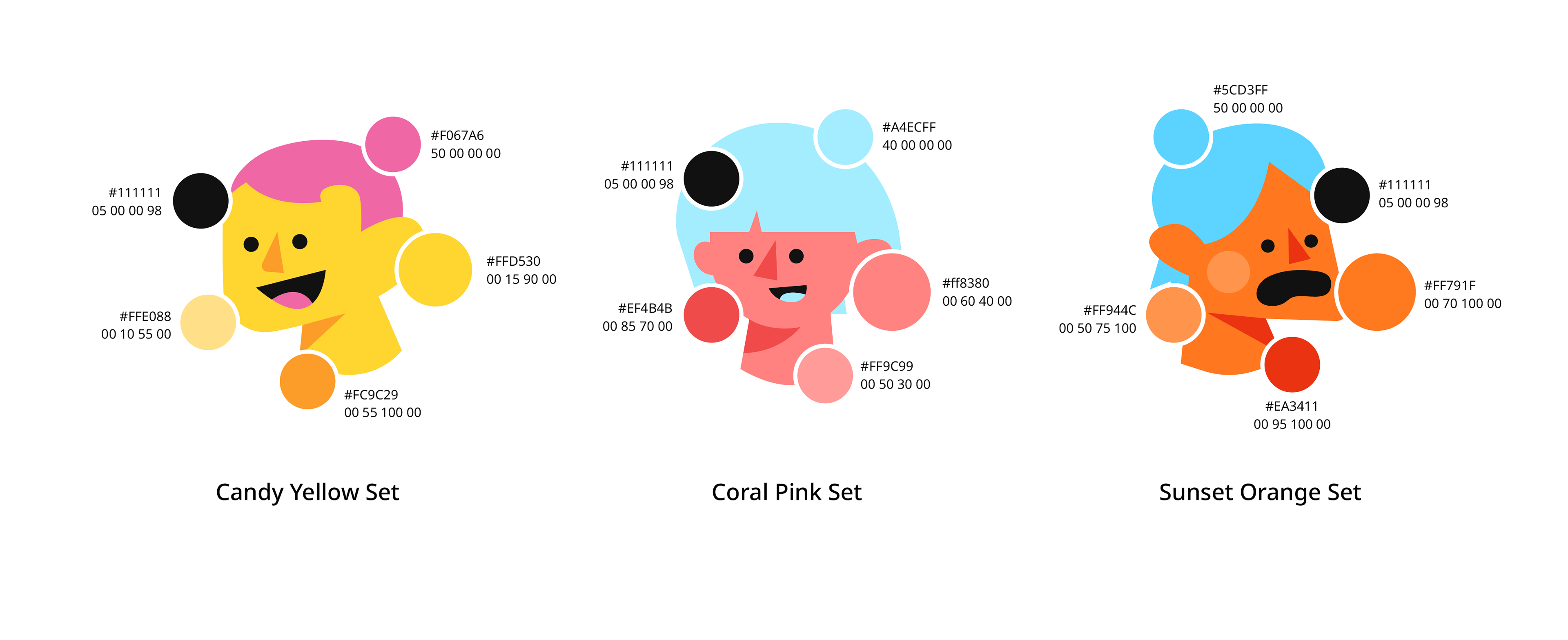
An illustration guide was created to plan the colours scheme and help with the brand architect, from the uses for different social media to the page architect of the website.
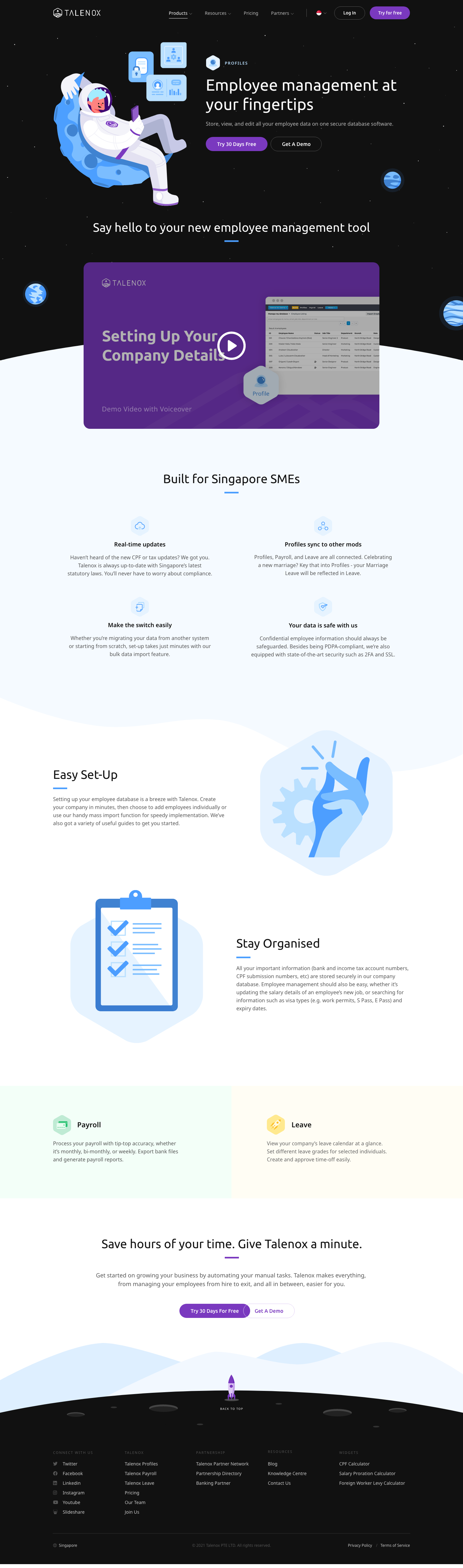
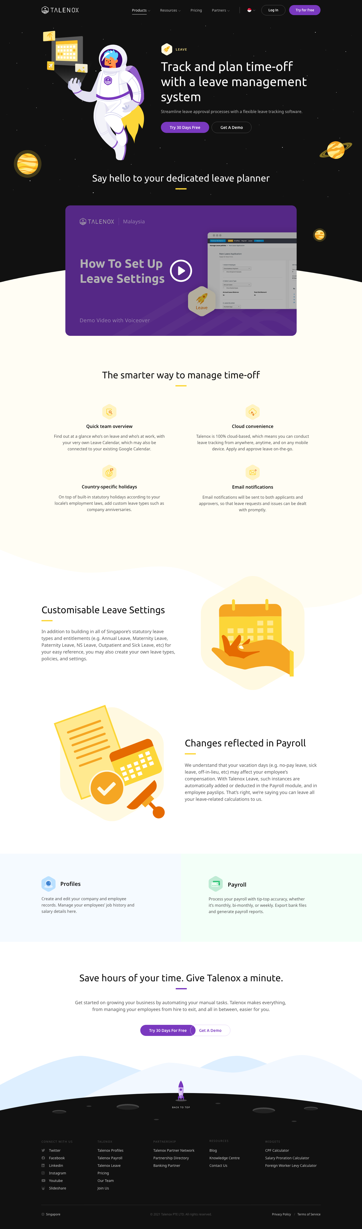
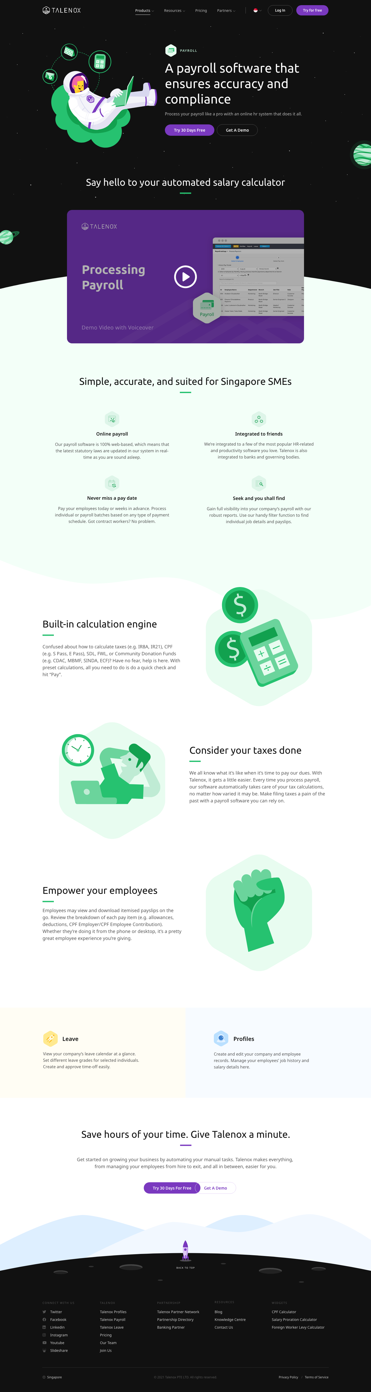
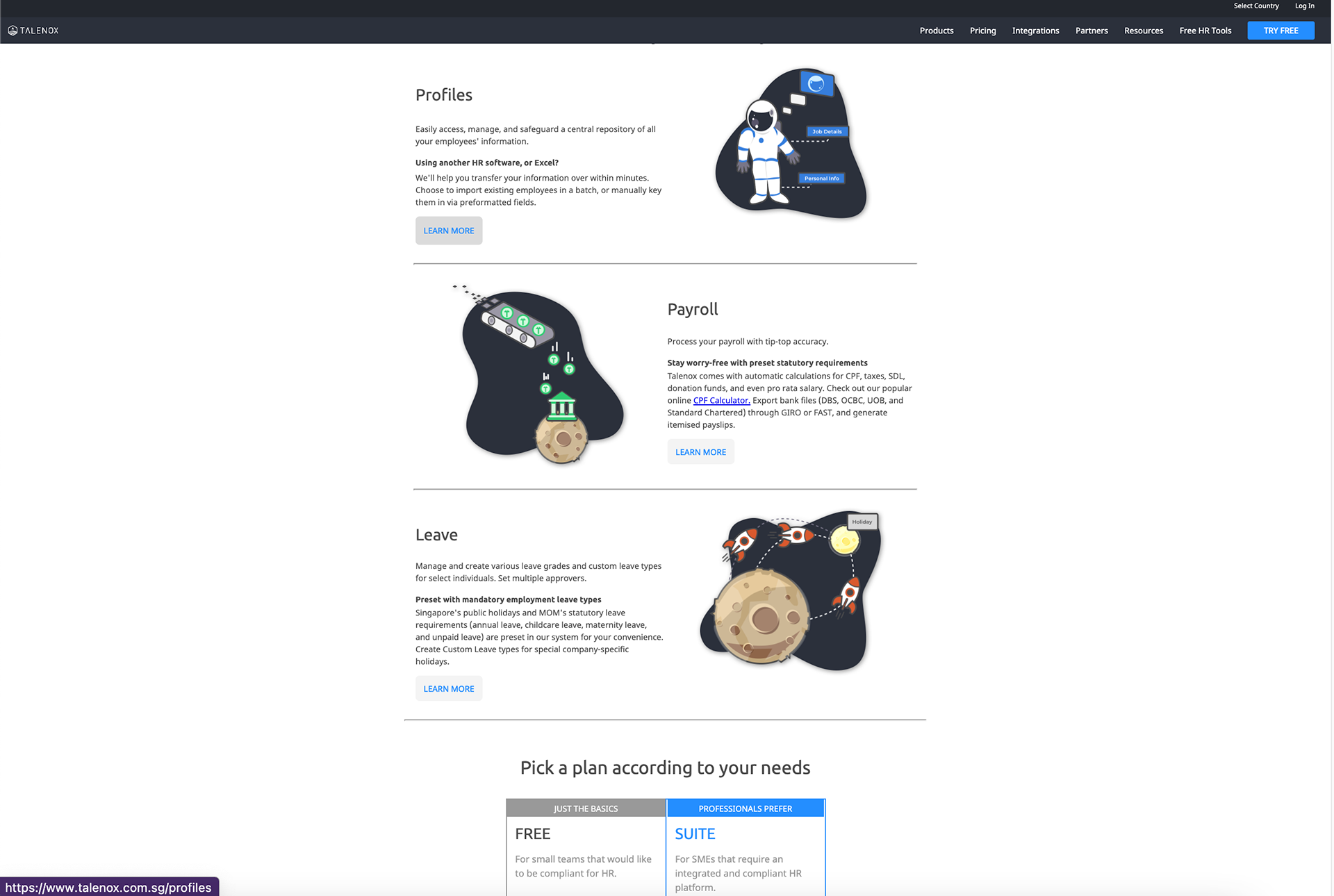
Each category or module in Talenox has its own set of colour scheme planned in the guide
Reflection and Outcome:
Ultimately, the goal of this rebrand is to give a face to our friendly and reliable brand, helping it stand out in a sea of mundane HR platforms. By aligning the brand’s identity with its vision and audience expectations, we aim to create a modern, cohesive look that feels fresh while clearly communicating our core values and commitments.
Update (Q4 2025):
The brand’s focus on being friendly, responsive, and known for eager-to-help customer support has put significant pressure on the Customer Success team. A new rebrand is underway to alleviate this pressure while maintaining the brand’s approachable identity.