
COMMUNITY COURSES REBRAND
Objective: A brand audit was called upon to assess current visual identity and user experience, with the aim of identifying opportunities to refresh the website so it better reflects modern design standards and meets audience expectations.
Role: Branding | UI Redesign | Web design
Outcome: To highlighted key areas for improvement in visual identity and information hierarchy. Recommendations were provided.
Key improvement points mentioned for old website
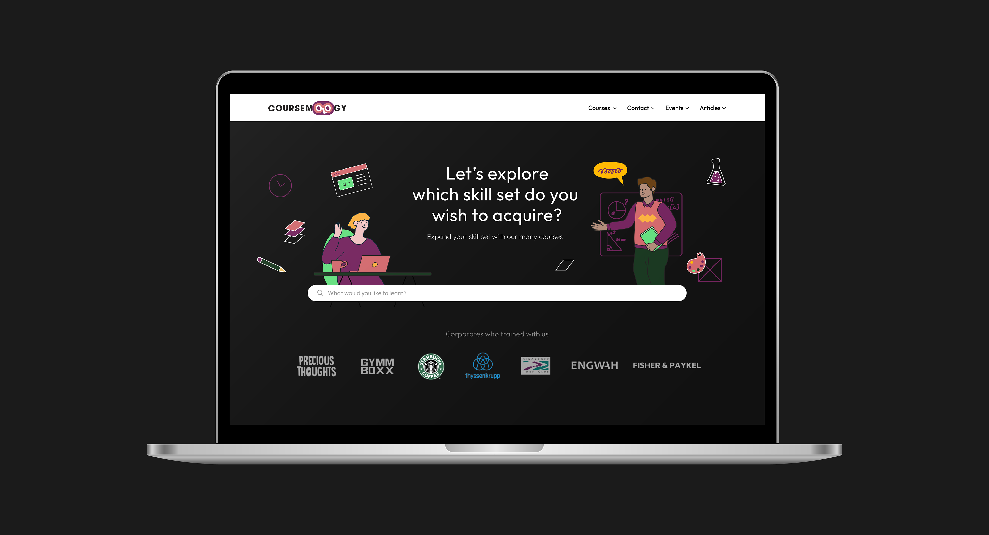
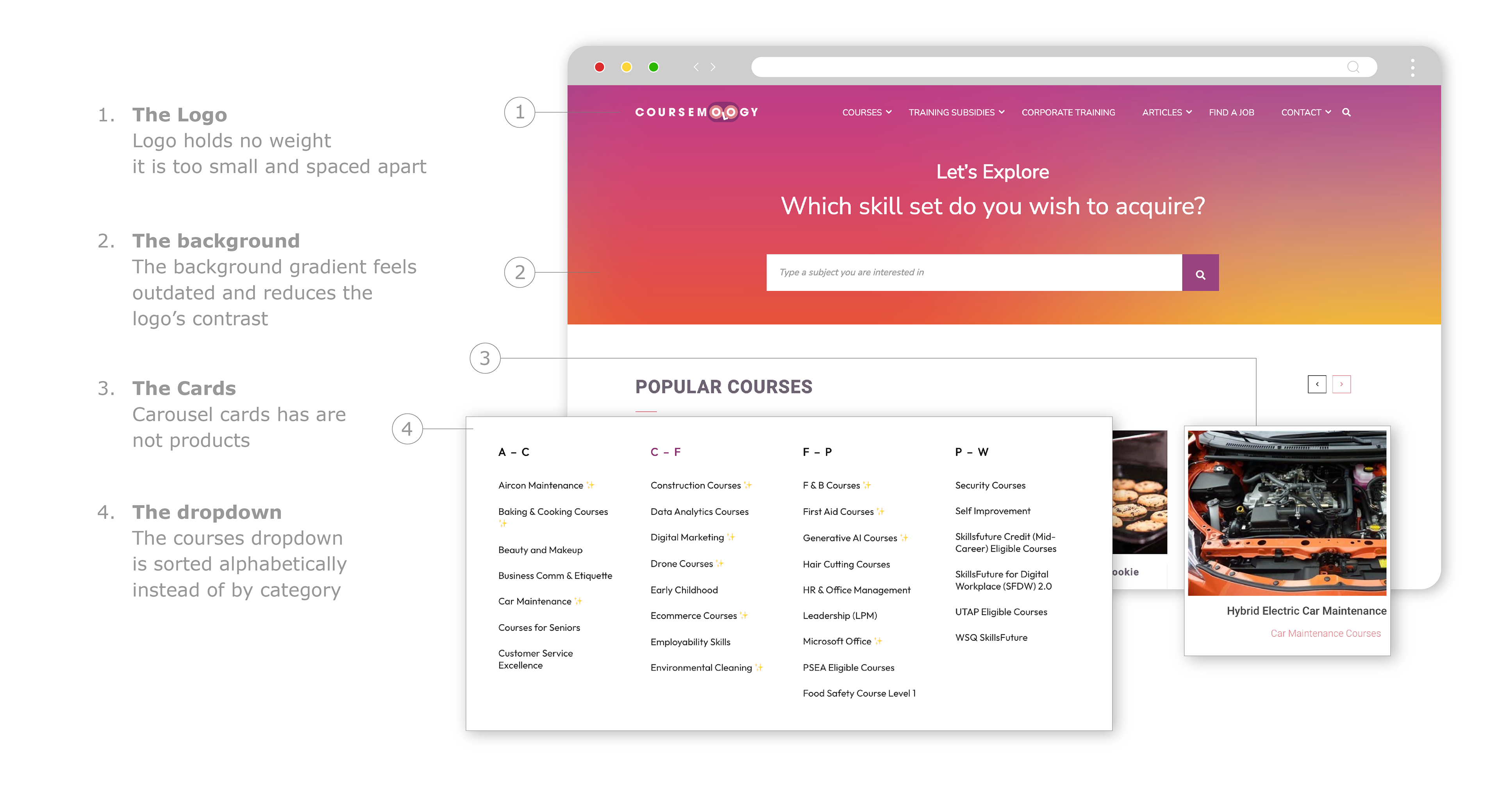
The Audit
1&2. The Logo and Background
Noting that the wordmark’s spacing and colour contrast with the gradient background reduced its focus, I suggested adjustments to improve visibility.
Noting that the wordmark’s spacing and colour contrast with the gradient background reduced its focus, I suggested adjustments to improve visibility.
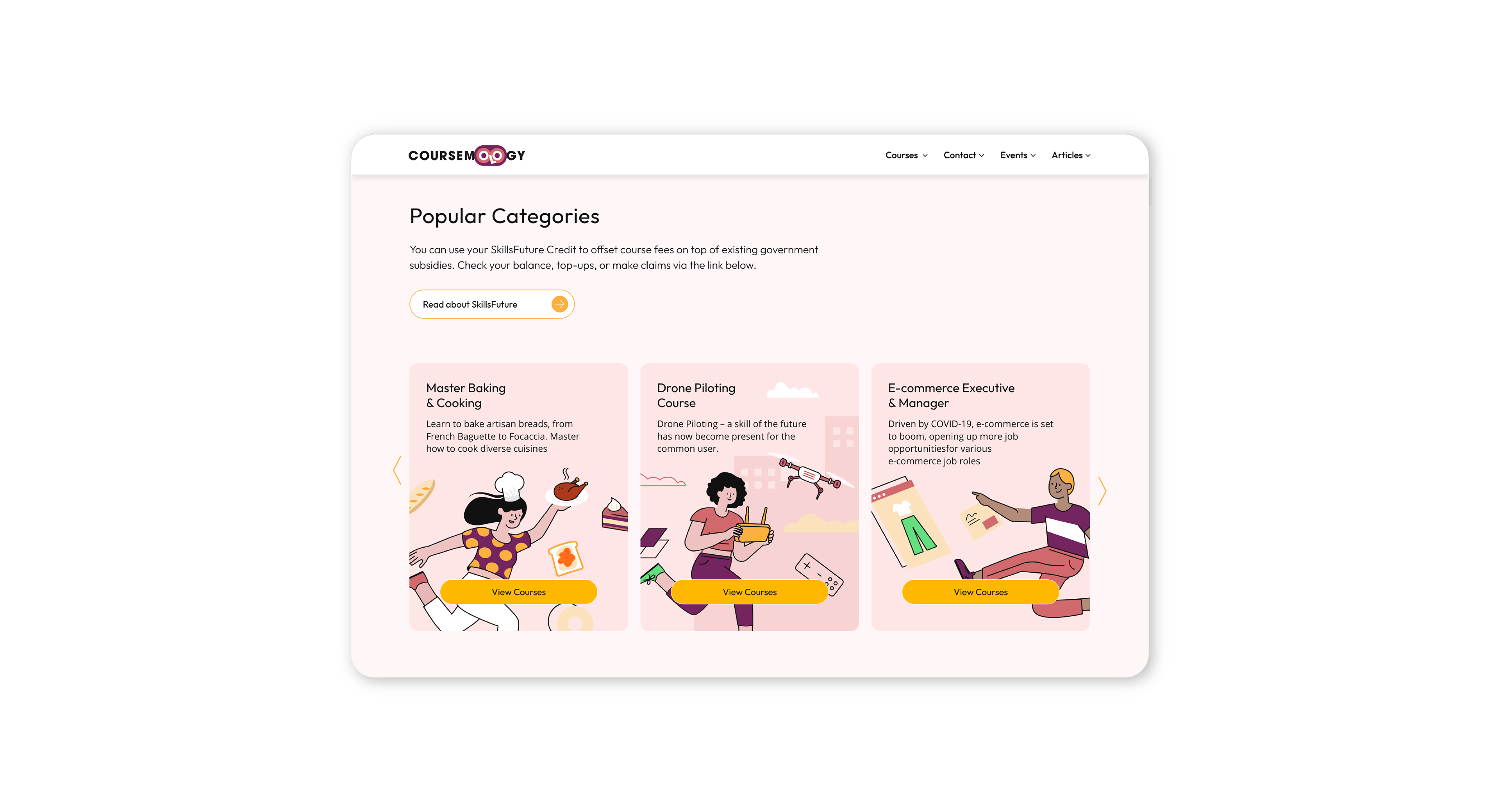
3. Carousel cards
Observing that the carousel cards act more like navigational pages than product listings, we recommended implementing clearer call to actions.
Observing that the carousel cards act more like navigational pages than product listings, we recommended implementing clearer call to actions.
4. Issues with A–Z Sorting
Pointed out that it is not how people think. Users don’t usually know the exact course name ahead of time. (Someone won’t think I’ll look under ‘C’ for Construction)
Another huge point is that related courses get split apart. Digital Marketing, E-commerce, Data Analytics all gets split apart as they are under different letters, even though they belong in one Digital/Tech category.
These cause huge cognitive load.
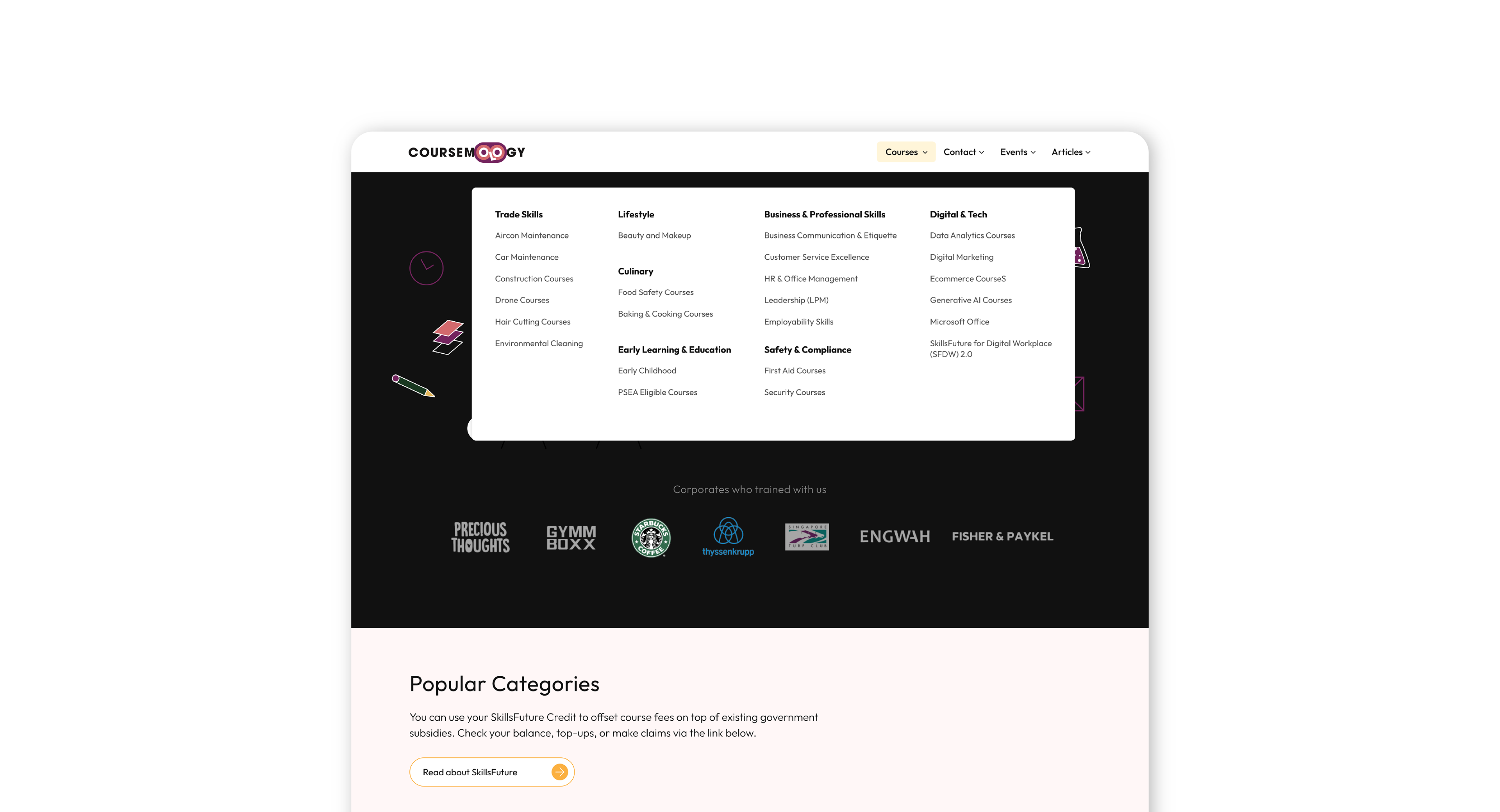
I've decided to suggest mirroring how users naturally think when searching for courses (“I want a business course” vs. “I want something starting with C”). as it helps scanning and quick decision-making.
Category cards that behaves clearer as navigational points, not products
Reflections
The client preferred a photographic approach and chose not to implement our suggestions, expressing concern that users might be unfamiliar with the new interactions.
The client preferred a photographic approach and chose not to implement our suggestions, expressing concern that users might be unfamiliar with the new interactions.
This showed me that all design ideas needs to balance user habits and very importantly, client comfort.